Showing posts with label D. Main Task: planning. Show all posts

Monday, 8 February 2016

Contact Sheet and Unedited Images


The Images that I have selected and taken will attract my target audience because the person I have taken the picture of is roughly their age (teenager to young adult) they are also wearing clothes that this age group would stereotypically wear and using a guitar. This is also the reason why I like and have selected to use these images.

Thursday, 5 November 2015

Construction Schedule

Construction Schedule

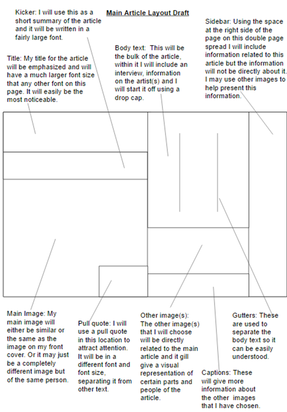
In this construction schedule I will make a plan for how I am going to make my magazine front cover, contents page and featured article and how how long I will spend on each section over the ten weeks that I have to construct these three pieces.

For week one and two I plan to make the drafts for my front cover, contents page and featured article I will construct these drafts without using images and just planning the placement of things like mastheads, images, titles, etc. and choosing what kinds of images and text I will use for my articles.

On week three I plan to take all of the images that I will use on all three sections of my product the images will consist of the people and props I will use and the locations they will be in.

Week four and five I will construct my front cover by using photoshop and the images that would have taken a week before I started this task.

I will construct my contents page on week six by using the plan and template I made on week one or two and by using the images I previously took, while I use other contents pages for inspiration.

Following the order that my tasks would appear in a magazine I will make my featured article on week seven and eight by using my original plan and images. I will need to make up create a completely new article that would fit into a music magazine about rock, metal and punk.

This would leave me with the final two weeks to check over my work for mistakes and to add any improvements if needed.

Colours Mood Board

Colours Mood Board
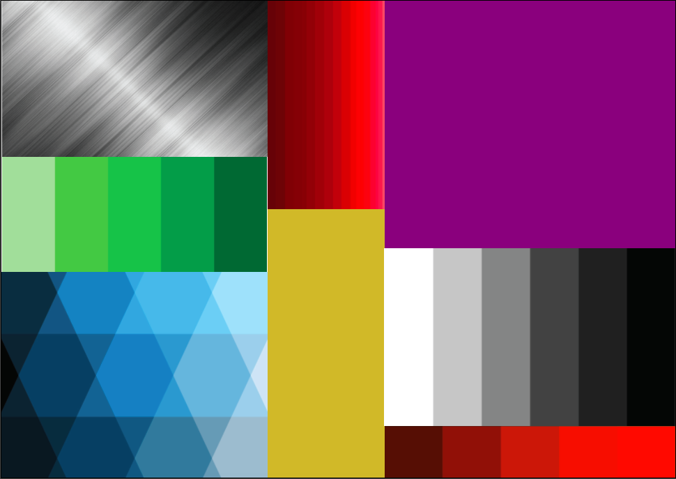
I have chosen these colours and shades for my project because they are associated with my target audience when use in certain combinations, for example when black is used with blue it creates an illusion of the blue being amplified. I have chosen colours like gold or shades of orange to highlight certain fonts for the articles of my magazine. I have chosen the metallic mixture of shades of white, grey and black because this is the kind of background that is commonly used in other magazines linked in with my selection of music genre for my project.

The colour black is usually used in magazines to set the mood of the reader to relaxed so they can enjoy the content of the magazines and when white is used as a background it is easier to see things on the pages such as pictures or fonts. I have also chosen other colours like purple and green and the shades of them that I have selected because they were highly requested in my audience research task, so I will use them either on the front cover to advertise a specific article of on the contents page for the same reason.

Monday, 2 November 2015

Location/Props/Costumes.

Location, Props and Costumes.

For the location part of this task I will be taking pictures of my target audience in either a local cemetery or a place where teenagers would stereotypically be, such as a coffee shop or in collage.
The props that I may use include a guitar for my selected person who will be photographed to hold or another instrument that is associated with rock metal or punk music such as an electric bass guitar.
The costumes that would be used in the photoshoot would be clothes that a punk-rocker would be expected to wear, these include jeans, torn clothing hi-top shoes ect.
I have chosen not to take my pictures in a studio because It will be easier and more time efficient to take a picture of the person at the location, rather that taking separate pictures of the person and location and then using photoshop to combine them.

I have chosen these locations props and costume because it will allow my product to be easily recognised as a punk-rock or metal magazine. These things will relate to my target audience because it would be where a teenager or young adult (my target audience) would stereotypically be and doing.

Fonts Mood Board

Fonts Mood Board

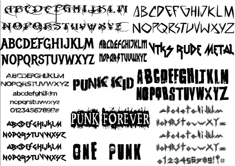
I have chosen these fonts for my punk, rock and metal music magazine for multiple reasons, the first is to draw the attention of my selected target audience (teens and young adults). Another reason to use these fonts is to boldly presents the title and/or masthead of the magazine in a simple way that can be easily understood. I have chosen most of these fonts because they look messy or goth-like which is what teenagers stereotypically are. Some of these fonts are somewhat difficult to read but this may attract my target audience. Another reason why I have chosen these fonts is because they are the kinds of fonts used on other similar magazines so my projects can be easily recognised as a punk rock and metal magazine.

Tuesday, 20 October 2015

Original Ideas statement.

Original Ideas statement.

The type of magazine I have chosen to make will be a music magazine based on rock, punk and metal music. The intended target audience will be teenagers and young adults of both genders because the genres of music I have chosen are more commonly associated with this age group than any other and it is not particularly directed at any gender.

I have chosen this particular type of magazine because in my opinion music magazines are interesting because of their up to date information on bands and artists and their inclusion of the reader by informing about festivals and concerts.I have also picked the genres of music because I am interested in these kinds of music. The magazine will mostly be about these three genres of music and won’t include many other topics or other genres of music, unless the other articles are directed at teenagers and would draw their attention.