Showing posts with label C. Main Task: research. Show all posts
Showing posts with label C. Main Task: research. Show all posts
Thursday, 17 December 2015

Monday, 2 November 2015
Target Audience Mood Board
Target Audience Mood Board.
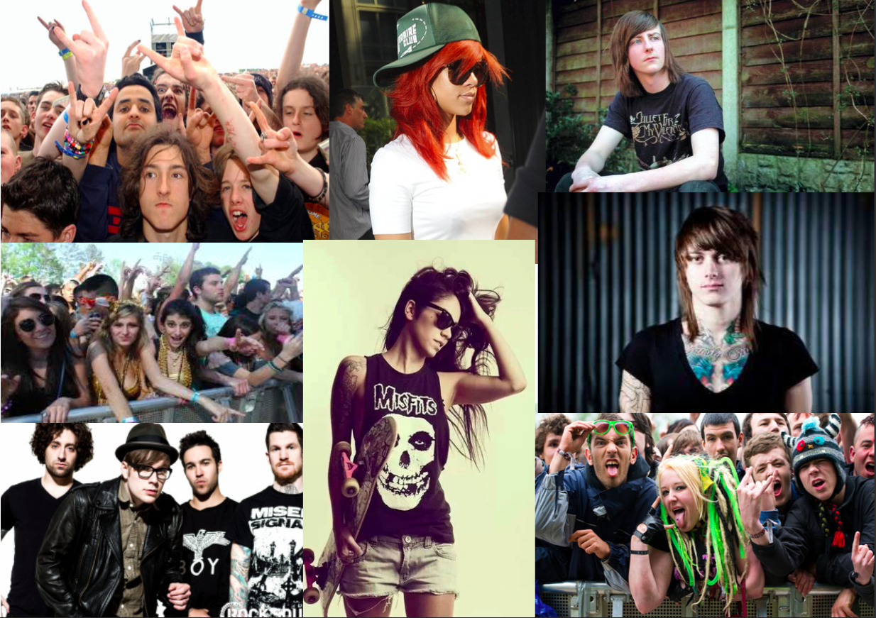
The target audience that will be aimed at by my project will be teenagers and young adults of both genres. I have chosen these age groups because they are commonly associated with rock, metal and punk music. This age group is also most likely to attend festivals, skate and use social media, so i can include information about articles of these subjects on the contents page of my final product.
This age group (teens and young adults) stereotypically are interested in rock, punk and metal music, so this is a good choice of a target audience for a magazine based on the same genres of music.
The images I have chosen are of teenagers and young adults wearing clothes that are associated with my selected genres of music. I have also provided these pictures to demonstrate what kinds of images I will use in my final product and what kind of people will read my final product if it were to be distributed as a real music magazine.
Advertisers Mood Board
Advertisers Mood Board
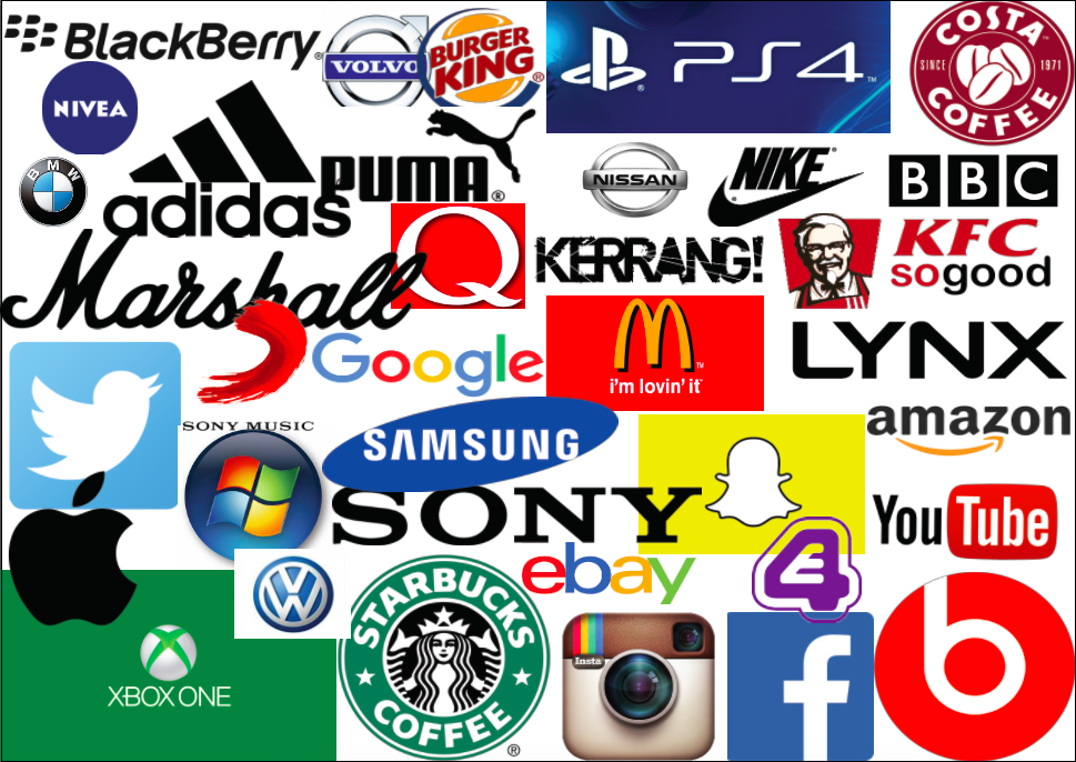
The advertisers that i have chosen are technology companies, social media sites, fast food restaurants, car companies and brands of clothing. I have chosen these because these advertisers are commonly associated with my chosen target audience (teenagers and young adults). I have also chosen advertisers such as Kerrang and Q because the produce music magazines similar to the magazine that I will produce. I have chosen social media sites such as facebook and twitter because these are ways of communicating and can spread information about magazines. Teenagers are associated with videogame consoles such as the playstation 4 or the xbox one and the advertisers could also choose to advertises the available games or software. I have also included the television channels E4 and the BBC because there is a wide range of things that these companies could advertise such as other tv shows aimed at teenagers and young adults. Coffee shops like Costa and Starbucks would be a part of a teenagers everyday life so it would be a good decision to have either one advertise in a magazine aimed at teens, this is the same for food business like McDonalds or KFC because my target audience would often go to these places. And finally clothing brands such as Puma or Nike would interest young adults because they are a popular choice of clothing.
Monday, 19 October 2015
Information on Magazine Publishers
Information on magazine publishers.
Time inc UK
For this task I will first be analyzing Time inc UK. Time inc UK (formerly known as IPC Media) is owned by Time inc, which is an American New York-based Publishing company that publishes over 90 different magazines. They also operate digital only titles: MyRecipes, The Snug and MIMI Time inc also owns the right to LIFE which is a well known magazine that has been published in many different formats. Time inc also owns and runs LIFE.com, a website that is dedicated to news and photography.
Time inc UK publishes a wide range of magazines, from Lifestyle and Music, Luxury and Specialist. The publish big music Titles such as NME and Uncut, but it also publishes non-music magazines such as Country Life, Feel Good , Homes and Gardens and more.
They publish Over 60 brands of media magazines, they get 28 million global users every month and they sell more than 350 million copies spread across all of their different kinds of magazines a year.
Some of Time inc UK's magazines are growing in popularity, for example Country life has increased in popularity by one percent in the last year and Country life has increased by three percent. Whats on TV (one of Time inc’s most successful magazines) is the second biggest TV title and is growing in sales at an average of 0.7 percent a year. But this magazine is still out performed by TV Times.
Time inc UK’s main target audience is upmarket women with a very high percent of all of the magazines they publish with them as the target audience. However Time inc UK also has a large targeting market for men with their genre of specialist magazines.
Time inc UK has multi platform products such as their website that features many different kinds of magazines and is regularly updated.
Bauer
The Bauer Media Group is a large European-Based media company that is owned by Yvonne Bauer (the publisher). It publishes the UK’s most popular and best selling music magazine; Kerrang!, but is also publishes other genres of magazines such as: Debrief (an online-exclusive magazine aimed at women in their twenties), Empire (a monthly film magazine), heat (a popular weekly magazine about celebrities) and loads more.
The Bauer Media Group owns and publishes a total of 120 different kinds of brands of magazines.
They have a wide range of brands for all ages so the audience of their magazines is not just one age group, from 4 music and absolute radio aimed at 18 year old's, to Trout and Salmon and Garden News aimed at 45 year old's and older.
The Bauer Media group owns many multi platform products, they own radio stations Bauer City 1-3, Bauer National, City Talk, Cool FM, Downtown Radio and Wave 105, these are mostly located across the UK. Bauer also owns TV channels, such as 4Music, Heat, Kerrang! and Kiss. They also have a fifty percent stake in Box Television (the other half is owned by channel 4).
Along with their magazines, radio stations and TV channels and similarly to Time inc they also have a website that advertises and informs readers and viewers about their products, it also offers subscriptions to their magazines, helplines and dates and locations to their events.
Bauer media group also owns a percentage of the market in the US because their is a branch of the media group in the US.
BBC Magazines
BBC Magazines is owned by the Immediate Media Company which is a combined publishing house consisting of Origin Publishing, Magicalia and BBC magazines. The Immediate Media Company itself is owned by Exponent Private Equity. It publishes over 30 magazines, it maintains over 50 websites and has a total of about 1100 staff employed. The CEO is Tom Bureau who has a background in digital media as well as traditional publishing.
Their main target audience is preschool children and pre-teens although they also have a wide variety of magazines for an older audience.
The music magazines they publish include Radio Times, Top of the Pops BBC Music and others and the other magazines they publish include BBC Knowledge, Top Gear, CBeebies weekly and others.
In the UK they they have most of the audience who is under 18, this is due to the fact that they produce a large range of magazines for children.
For their multi-media products they have over 50 websites about their magazines and their content and they are involved with multiple TV channels such as BBC and CBeebies.
Thursday, 15 October 2015
Overview of the Magazine Industry
Overview of the Magazine Industry
The magazine industry is a huge part of everyday life for most people. It as a whole has accounted for an estimated twenty-three thousand jobs in the UK, there is almost an even percentage of males and females working for the magazine industry. It offers a wide range of jobs throughout the industry and if the industry reclined the results would be devastating.
The gross value added by UK publishing in 2014 was estimated to be £9.94billion (which has risen from £8.97billion in 2008).
In 2013 just the publishing exported services were worth £1.3billion up from £806 on 2009.
The UK is the leading publisher of magazine titles, it is the most developed in the world and it is worth £1 billion each year.
The magazine industry is also surprisingly very popular overseas, forty percent of the revenue for the UK’s magazine industry is generated by export sales and millions of copies of magazines from various companies have been translated for oversea consumers.
Newsstands are an important part to consider about the magazine industry because even though they sell only a few single copies of magazines they are still responsible for seven percent of the magazine industry's revenue.
Another major part of the magazine industry for both consumers and producers are subscriptions because this provides convenience for the producers and consumers.
In recent years the magazine is becoming more digital, this is very convenient for consumers but this is also causing a small decline in sales for some companies because more people are using digital copies and not needing to buy physical copies. There is also more internet traffic for websites hosting these magazines, specifically from mobile devices.
In the industry overall the broader consumer magazine industry experienced another difficult year in 2014. Magazine circulation fell for the seventh year in a row. Things were partially bad for newsstand sales, which fell by fourteen percent, the biggest decline since 2008.
Complete Analysis of a Music Magazine
Complete Analysis of a Music Magazine
The brand of magazine that I have chosen is Kerrang!, it has been around since the 6th of june 1981 (the first published copy). It was first meant to be a one-time installment of the Sounds newspaper. It first launched as a monthly magazine and was eventually published fortnightly, not long after that in 1987 is was being made on a weekly basis.
During the 1980s and early 1990s the magazine mainly focused on many thrash and glam metal bands but later changed to grunge. Kerrang! grew in popularity again in the early 2000s due to the rise in popularity for the nu metal genre. In 2008 the previous owners sold the rights to the magazine to Bauer Media Group.
Kerrang! is the world's largest weekly music magazine and the median age of its audience is 22 years old, the average audience are British males.
This magazine is typically aimed at teenagers to young adults but it can be aimed at a wide variety of age groups. It constantly tries to appeal to its readers by focusing on the big things in the music industry that are happening at the time and by focusing on a wide variety of bands. This could have lead to the magazines success.
There are many multi-platform aspects of this magazine, it has its own website, apps and even TV channels. Kerrang!’s website is similar to the magazine, it offers similar and regularly updated content as well as articles on what is trending and advertisements. It's television channel is also loosely linked in with the magazine, they both showcase nu metal and pop punk /skate punk. The TV channel also tries to appeal to its audience by doing things such as their infamous rock which covers the most requested songs of the year (voted by viewers of the channel).
Tuesday, 13 October 2015
Featured Article Analysis
Music magazine featured article analysis.

Title: The title;
‘NME love The Teenagers’ is meant to draw in the reader’s attention because the
title states that NME (which is the brand of this magazine) loves this
particular band and the reader will be reading this same brand of magazine so
they will want to know why.
Gutters: On this
double page spread there is two gutters on the left side which is also the main
body text, there is a small amount of other text on the right side of this
double page spread that’s is not directly part of the article. This article
seems to be quite short compared to other main articles.
Kicker: There is
a very small kicker below the title giving some information on the main article.
Kickers are often longer that this selected one.
Pull quotes: There
is a pull quote in-between the two gutters that provides some more information
on the featured article. A common action taken by regular magazine users is to
first read the title, kicker and the pull quotes to see if they would be
interested or want to read this article or not. Pull quotes are often just
quotes by one of the members being interviewed or a quote the have given just
for the article.
Drop cap: The
drop cap is something that is used in nearly all articles, it indicated where
the article starts and where to begin.
Subheadings:
There is no subheadings for this featured article, it is uncommon for music
magazines to have subheadings. What subheadings are actually meant to do is
just to give a heading to a sub-section of an article.
Caption: Captions
are another thing that is uncommon in music magazines, however this article
does have a small amount of information on the main image of this featured
article.
Sidebar: A
sidebar is a part of an article that tells the reader about something linked to
the article but not directly about it. This article has a sidebar with three
separate smaller articles that are all about similar styles of music. The
sidebar for this featured article covers half of the right page and is as large
as the featured article itself.
Colours and font: The
colours used specifically for this article are: blue, black, white and brown.
The standard amount of colours used for any article for any kind of magazine is
usually under 5 because the article would too messy and complicated if there
were too many colours. The colours used for this article are typically related
to teenage boys who are into rock or indie music. There is about three or four
different kinds of fonts in this article, the different fonts are used for
different things, for example the font used to write the main article is easier
to read that the fonts in the sidebar because there is more text in the main
article.

Title: The title
for this featured article; ‘The new first lady of pop-punk’ is a different
approach for this magazine (Kerang). Kerang usually don’t have articles
directed at slightly younger female audiences. This may attract more attention
for the magazine.
Gutters: There
are three gutters on the left hand side of this double page spread that present
information like it should.
Kicker: The
kicker for this article gives more information than the last, it gives the
reader more of an idea of what the article is going to be about.
Pull quotes: There
is only one pull quote for this article and it is next to the main image to
take up white space. The size of this text is larger than most other pull
quotes, this is another way of attracting the reader’s attention.
Drop cap: The
drop caps are something that is used in nearly all articles, it indicated where
the article starts and where to begin. This article has two drop caps, one to
symbolize where the article starts and the other to show where the next
paragraph beings after the first gutter has finished.
Subheading: Similar
to the last article; this article does not have any sub headings through the
main body of the text.
Captions: There
is a caption for the other image in the bottom left corner of these pages that
is explaining the image in more detail. The pull quote for the main image works
as a caption even though it doesn’t have a proper caption.
Sidebar: The
sidebar for this article includes lots of images, this aids the reader
visually, it is also coloured in pink, making it stand out with part of the
title of the article.
Colours and fonts: This article includes more colours than an
average article; white, black, yellow, pink and blue. This makes the article
slightly messy looking but this works well with the article content because it
is aimed at teenagers (who are stereotypically messy).
Contents Page Analysis

Note from the editor:
On this monthly magazines contents page there is no note from the editor.
Colours: The main
colours used for this contents page are about the same as the cover of this
magazine (black white and red) which is very common for music magazines.
Masthead: The
masthead from the front of the magazine is re-used twice for the contents page.
This image is the logo of the magazine and will be used in the same way for all
of these magazines that are made.
Main image: The
main image is of a band that this magazine is using as its main article, it has
a small amount of information and the page that this article is featured on.
The main image includes the band members of the selected band on a hill, they
look like they are associated with rock music.
Other images: The
only other image is of a man standing next to a pillar which doesn’t seem to
fit into a magazine about rock music, it is out of place.
Subscription offer: The
contents page of this magazine does not offer a subscription offer, but there
is a page dedicated to this show by the contents page.
Every issue: In
this magazine there are some articles that will be included in the magazine
every month. These include: Mail, 50, Subscriptions, Crossword and Ten
commandments. Also included in this particular issue are a wide variety of
music related articles such as: Buskers, MP4 etc.

Colours: This
magazines cover is mostly black white and red similar other music magazines.
Masthead: The
masthead on this contents page is the same as on the cover (as it should be)
and the page has the word ‘contents’ so it is easy to recognise. The masthead
for this magazine will be reused thorough out the magazine so that it can be
easily identified.
Main image: The
main image is band member performing by playing an electric guitar and singing
while there is another band member in the background, the type of clothes that
the main member is wearing (a black tank top and sunglasses) suggests that he
is a member of a rock band.
Other images: The
only other image on this contents page is of the cover of this magazine, it is
advertising the subscription offer for the magazine.
Subscription offer:
At the bottom middle of this page there is a subscription offer for this
magazine being advertised. The reason for this is that the consumer will get a
small discount on the average price of the magazine and he/she is guaranteed to
get them, so this benefits both the magazine company and the consumer. This
offer also provides details on how to subscribe and when the offer ends.
Every issue: This
magazine doesn’t have a dedicated part of the magazine to show which parts are
mentioned in every issue, however it does still list all of the main articles
like a contents page should.
Magazine Cover Analysis

Main Image: The
main image is a picture of a male in their early twenties, he is clearly a fan
of punk rock/ metal music which is indicated by his red-dyed hair and his black
leather jacket. The Image gives a vibe that is directed at both male and female
teenagers.
Other Images: The
other images are showing small previews of the free posters that are included
in the magazine. These free posters will attract the attention of fans of the
bands included on the posters so they will be more likely to buy the magazine.
These images do not look out of place compared to the main image so the suit
the genre of music that this magazine is about.
Cover lines: The
cover line is about festivals and tours which is a common activity for
teenagers, this is another way the magazine will attract attention. The cover
lines also make the reader want to read the contents of the magazine by saying
“amazing line-up reveal” which will make anyone attending the selected event
want to read.
Masthead: The
masthead is “NME” which stands out because it is white text in front of a blue
and red background, the masthead is also bold and all in capital letters;
making it easily noticed.
Font: The font
that is used is very bold and blunt but it is also effective because it is all
in capital letters and easy to read. The font is also the kind of font that you
would expect to see in a magazine for teenagers, it doesn’t look formal but
also doesn’t look to informal.
Colors: The main
colors that are used in the front cover are black white and red. These are
colours that work well together. They don’t look out of place for a magazine
for teenagers.


Main image: The main image if of a male in his late twenties to thirties who looks like he is a fan of heavy metal music. He is in front of a white background which draws the reader’s attention to the main image. He is wearing a black jacket which is a common colour for heavy metal enthusiasts. This magazine cover looks like it is aimed at both males and females in their late teens to early twenties.
Other images:
There are many other images of various band members with messy hair (which is
also a common trait for fans of heavy metal music). There are small previews of
the free posters that are included with the magazine to attract attention of
people considering buying the magazine. The other images (like the main image)
also look associated with heavy metal.
Cover lines: The
cover lines are promoting the articles written about inside the magazine which
will also attract the attention of the desired target audience. “I could be
your worst enemy” would make the reader want to read the article involved.
Main Cover line:
The main cover line; “30 seconds to mars” is related to the main image because
it is mentioning a popular song that the person in the main image is involved
in.
Masthead: The
masthead “Kerrang!” is supposedly the sound an electric guitar makes when it is
strummed, the font also looks cracked and broken. The font colour is white in
front of a black background and it ends with and exclamation mark which makes
it stand out. It is centered at the top of the page making it easy to see and
easily recognized. Overall it is fairly complex but effective.
Font: There are
multiple fonts used on this cover of this music magazine, some are used for the
different featured articles. For example: the font used to advertise the free
posters about black metal included is unprofessional.
Colours: The main
colours used are black white and red again which is common for music magazines.
These are colours that work well together and they don’t look out of place for
a magazine for the target audience.
Wednesday, 30 September 2015
Subscribe to:
Posts (Atom)